How to Read AutoAlpha's Market Analysis Charts
Run this analysis on any car in 60 seconds
Paste any the UK's leading car marketplace search URL - or use the filters - and AutoAlpha builds every chart shown in this guide automatically. Free to start, no card needed.
Every AutoAlpha search produces the same set of charts automatically - but knowing what each one tells you (and how to use it to make decisions) is what separates a confident buyer from one guessing in the dark. This guide walks through every chart using a real search: 1,691 Ford Focus listings scraped from the UK's leading car marketplace UK.
We'll cover what each chart shows, how to read it, and - most importantly - what action to take based on what you see.
The search: Ford Focus, nationwide, all years
The Ford Focus is one of the most-listed used cars on the UK's leading car marketplace UK at any given time, which makes it ideal for demonstrating what rich data looks like. The search was run nationwide with no year or mileage filter - giving a full picture of the market from the oldest examples to the newest.
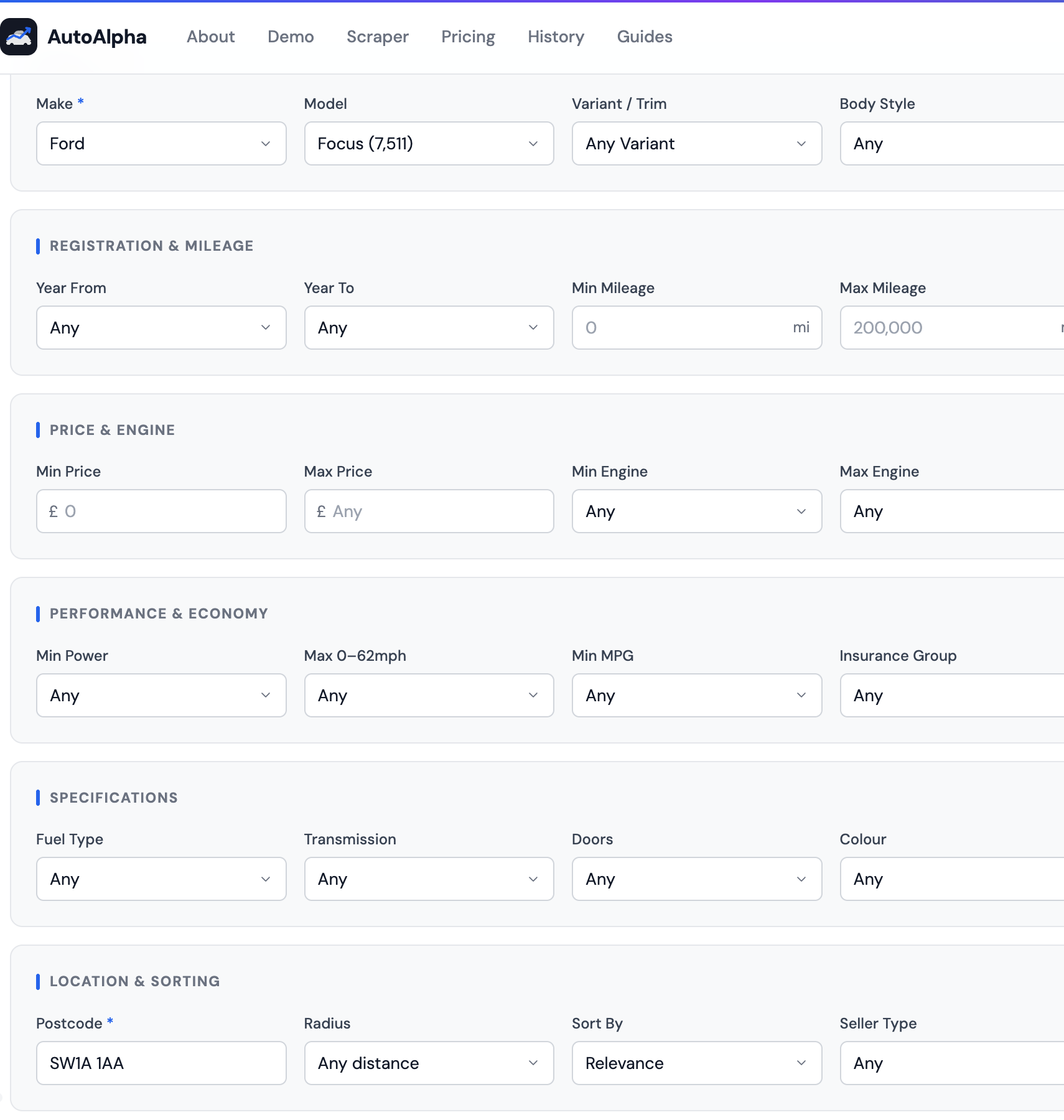
The search form: Ford → Focus, nationwide. The model dropdown shows 7,528 estimated listings - we scraped 1,691 in this session.
The headline stats: your first read of the market
Before any chart loads, AutoAlpha shows four headline numbers. These are the fastest possible summary of a market:
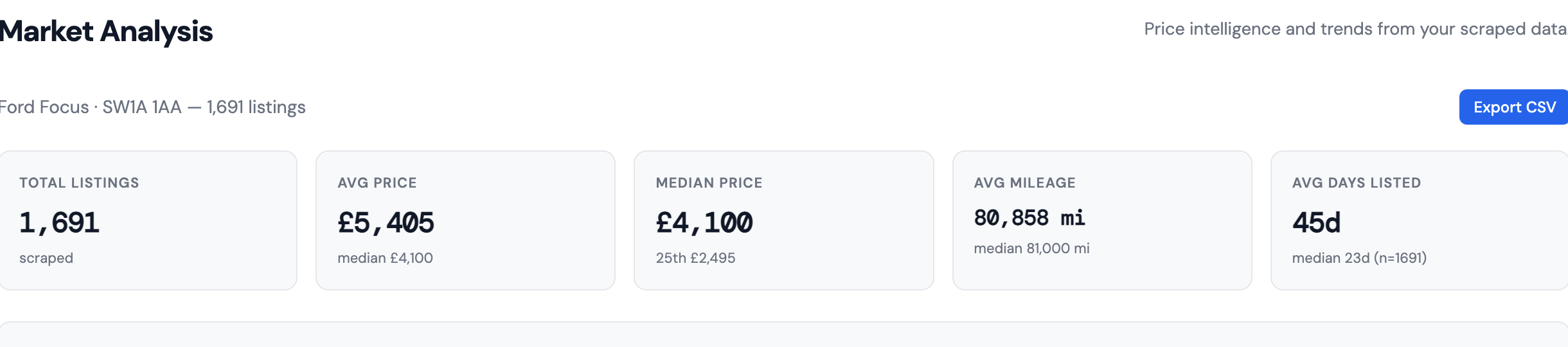
The headline stats panel: the four numbers that tell you the shape of the market at a glance.
Why the gap between average (£5,405) and median (£4,100) matters: The average is pulled up by a minority of expensive, low-mileage examples. The median - the middle value when all listings are sorted by price - is a much better indicator of what a typical Focus actually costs. If you're budgeting, use the median. If the car you're looking at is above the median, it needs justification (lower mileage, newer year, better spec).
The 45-day average listing duration tells you this is not a fast-moving market - Focus stock sits for a while. That means sellers are generally more open to negotiation than in markets where cars sell in days.
Chart 1: Price Distribution
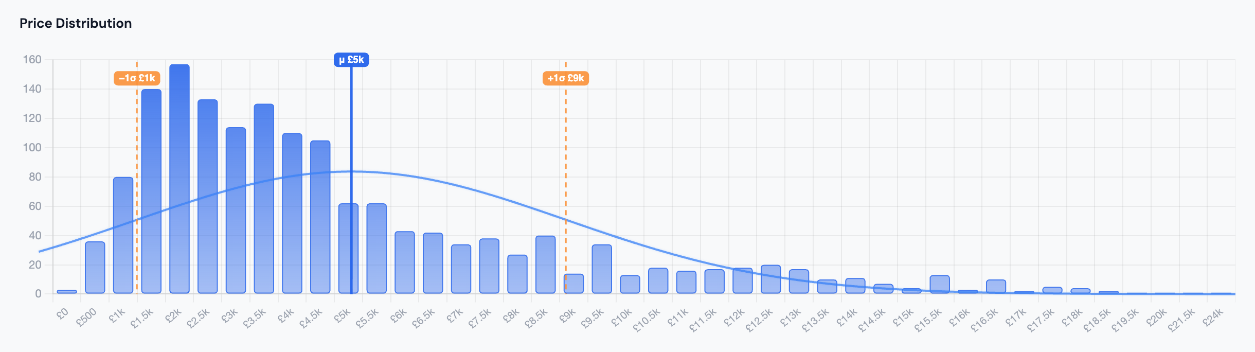
The price distribution histogram: each bar shows how many listings fall within a price range. The taller the bar, the more supply at that price.
The price distribution histogram is the most important chart on the page. It shows how listings are spread across price ranges - and the shape of that distribution tells you a lot:
- Where the bars are tallest is where most supply sits. For the Focus, the peak is heavily concentrated between £1,000–£6,000, with the highest bars around £2,000–£4,000. This is where the market lives.
- A long right tail (bars continuing at low height into higher prices) means a small number of expensive examples - newer, lower-mileage cars - pulling the average up. This is why the average (£5,405) is so much higher than the median (£4,100).
- A sharp left edge means there aren't many very cheap examples - below £1,000 there's very little. This tells you the floor of the market.
How to use it: If you're looking at a car priced at £7,000, this chart immediately shows you it's in the upper quarter of the market. You'd need a strong reason (low mileage, recent year, full history) to justify paying it. If you're looking at a car at £3,500, you know you're near the median - a fair price, but not a bargain.
Chart 2: Average Price by Year
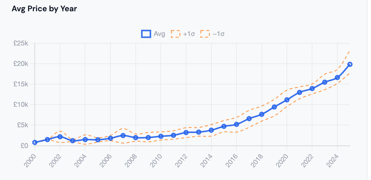
Average asking price by registration year. The steeper the curve in a particular era, the more each year of age costs you.
This chart shows the average asking price for each registration year in your search results. It's the depreciation curve made visible - and for buyers, it's a map of where value concentrates.
What the Ford Focus data shows:
- Pre-2015 examples are clustered under £4,000. There's limited year-on-year price difference between, say, a 2010 and a 2012 - both sit around £1,500–£2,500.
- 2017–2020 is where the curve steepens sharply. Each additional year in this range adds significant money. A 2018 Focus averages around £7,000–£8,000; a 2016 is closer to £5,000.
- 2022+ carries a premium - these are near-new cars with low mileage, priced accordingly.
How to use it: Find the "elbow" - the year where the curve bends sharply upward. Buying just before the elbow often gives you the best combination of recency and value. For the Focus, that's roughly 2016–2017. You get a modern enough car without the steep premium of 2019+.
Chart 3: Average Mileage by Year
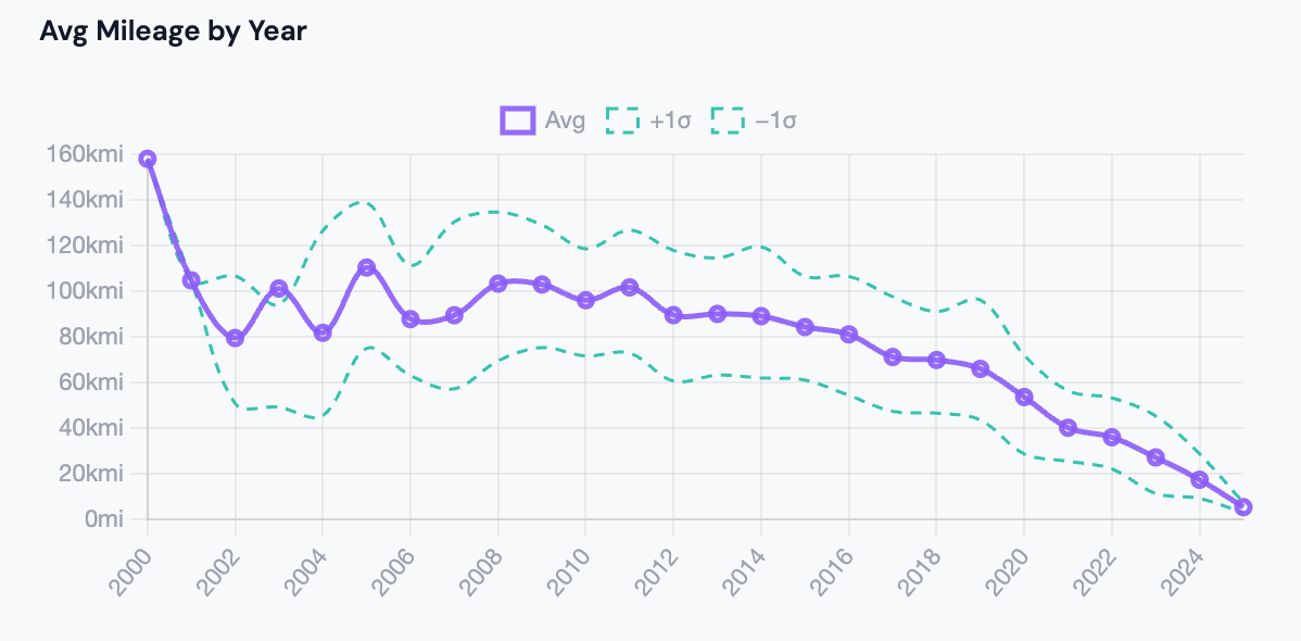
Average mileage by registration year - the expected "wear level" for each age of car.
This chart is the counterpart to the price chart. It shows average mileage by year - which tells you what a "normal" mileage looks like for each age of car in this market.
For the Focus, older cars (pre-2012) average 80,000–110,000+ miles. Cars from 2018–2020 average 40,000–60,000 miles. This is roughly what you'd expect from a car averaging 10,000–12,000 miles per year.
How to use it: Compare any specific listing's mileage against the chart's average for that year. If a 2016 Focus is advertised at 95,000 miles but the average for 2016 is 65,000 miles, it's been driven hard - and should be priced accordingly. The Best Value tab does this comparison automatically (it flags listings where mileage is below average for the year), but this chart lets you do a quick visual sanity check on any listing.
Chart 4: Days on Market Distribution
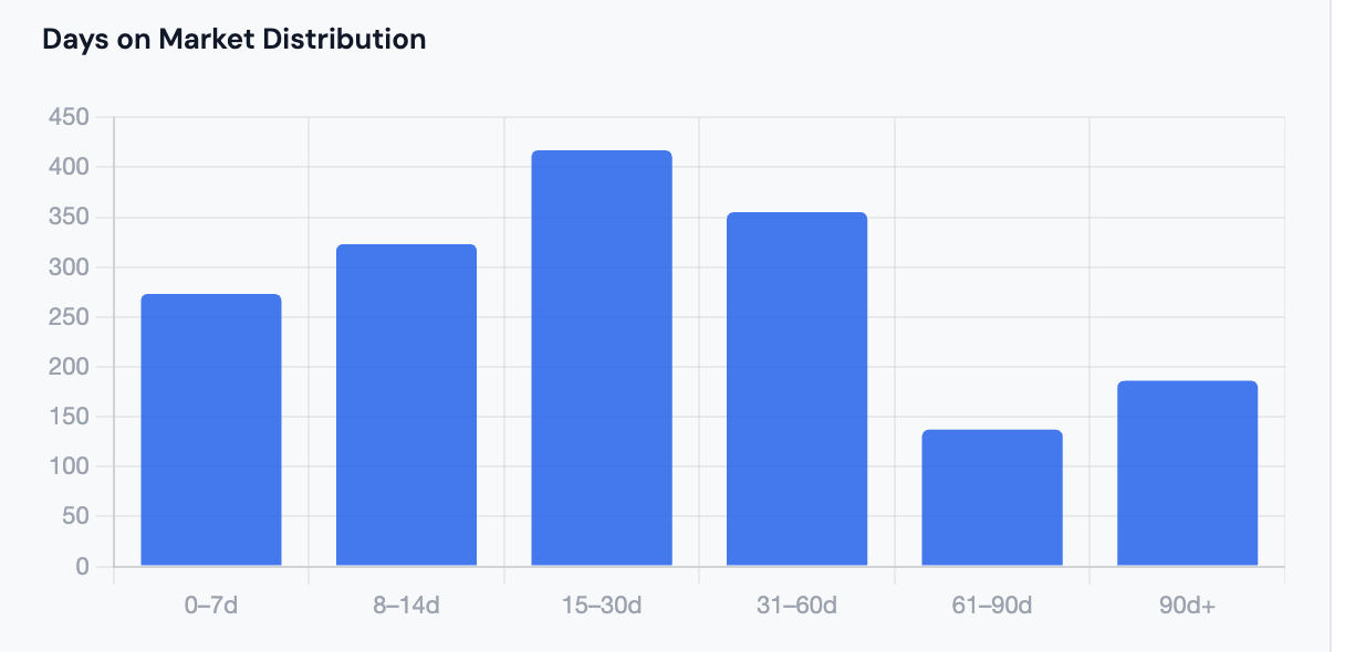
How long listings have been live on the UK's leading car marketplace. A long tail of slow-moving stock is a strong signal of overpriced cars - and negotiating leverage.
The days-on-market distribution shows how long current listings have been active. The median is 23 days, but the average is 45 days - meaning a significant tail of cars that have been sitting unsold for months.
What the shape tells you:
- The tall bar on the left (0–10 days) represents fresh listings - cars that just hit the market. These are typically well-priced.
- The long right tail (60, 90, 120+ days) is cars that haven't sold. This is almost always a price problem. Sellers who've had a car listed for 3 months and haven't had a buyer are usually ready to deal.
How to use it: If a car you're interested in has been listed for 60+ days, open with a lower offer than you otherwise would. The seller has already demonstrated the market doesn't agree with their price. The AutoAlpha results table shows days listed for every car - sort by this column to find the oldest stock.
Chart 5: Price vs Mileage Density Heatmap
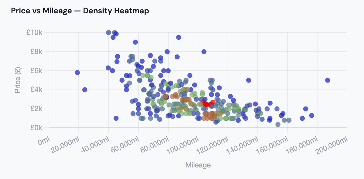
The density heatmap: each cell shows how many listings fall at that price/mileage combination. Hot colours = more listings. The diagonal band is the "normal" market - outliers outside it are priced wrong.
The heatmap plots every listing by price (Y axis) and mileage (X axis). The colour intensity shows how many listings cluster at each combination - bright/hot colours mean many listings; cool/dark colours mean few.
For the Focus, the hottest band runs diagonally from bottom-right (low price, high mileage - older budget cars) to upper-left (higher price, low mileage - newer cars). This is the "normal" market relationship: more miles = lower price.
What to look for:
- Listings well below the band (low price for low mileage) are potential deals - they're underpriced relative to comparable cars.
- Listings above the band (high price for high mileage) are overpriced. The seller is asking for low-mileage money on a high-mileage car.
- The cluster density shows where most cars live - the Focus market is densest around £2,000–£5,000 / 50,000–100,000 miles.
How to use it: When you're evaluating a specific car, mentally plot it on this chart. If it falls clearly below the main band, it's worth investigating. If it sits above the band, ask why - the seller may have an inflated sense of their car's value.
Chart 6: Seller Type & Top Locations
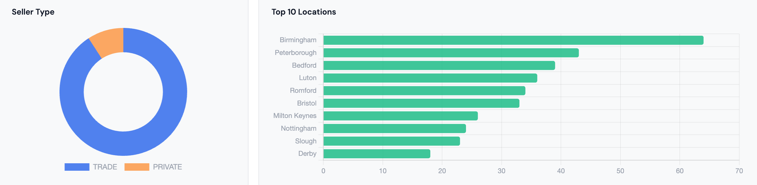
Left: the split between dealer and private sellers. Right: the top 10 locations by listing count - useful for understanding where supply is concentrated.
Two charts sit side by side here. The seller type donut shows the proportion of dealer vs private listings. For the Focus, dealers dominate - which is typical for a mainstream family car. Private sellers tend to price slightly lower on average (no dealer margin to cover), but come with less consumer protection.
The top 10 locations bar chart shows where stock is concentrated. London, Birmingham, Manchester and other major cities dominate - unsurprising for a nationwide search. If you're willing to travel slightly outside a major city, you'll often find the same cars with less competition from other buyers.
How to use it: If you're open to driving to buy, filter your the UK's leading car marketplace search to a specific city where supply is highest and competition lower. The locations chart also helps you understand whether a dealer is in a high-cost area (where overheads push prices up) or a regional market where the same car might be listed cheaper.
The Forecasting tab: depreciation curve and underpriced alerts
The Forecasting tab builds a depreciation curve directly from your scraped data and extends it forward as a short-term price trend forecast. Unlike static depreciation tables, this curve is drawn from actual live asking prices for your specific search - so if you searched for a manual petrol VW Golf in the South East, the curve reflects that exact market, not a nationwide average.
The tab also surfaces an Underpriced Listing Alerts table: every listing priced 15% or more below the average for its registration year, ranked by discount size. These are the cars the Best Value scoring algorithm flags as strongest outliers - useful as a quick-scan shortlist before diving into the full results table.
How to use it: Run a search, switch to Forecasting, and scan the alerts table first. Any car showing a 20%+ discount on the same-year average is worth checking - open the listing directly to see why it's cheap (high mileage, damage disclosed, private seller, etc.). The depreciation curve also tells you whether you're buying at a good point on the curve or if waiting a year would yield a significantly cheaper car.
The Regional Analytics tab: where prices are lowest
The Regional Analytics tab breaks your scraped listings into UK regions and shows two charts side-by-side: average asking price by region, and stock density (number of listings) by region. A summary table below gives you the exact numbers for each region.
How to use it: Look for regions where stock is high but average price is low - that's where supply exceeds demand and sellers are more likely to negotiate. Conversely, if you're selling, the regional breakdown shows you where buyers are paying the most. For dealers sourcing stock, this tab is particularly useful for spotting geographic arbitrage: buy in a high-supply, low-price region, retail in a high-demand area.
The Best Value tab: where the algorithm does the work
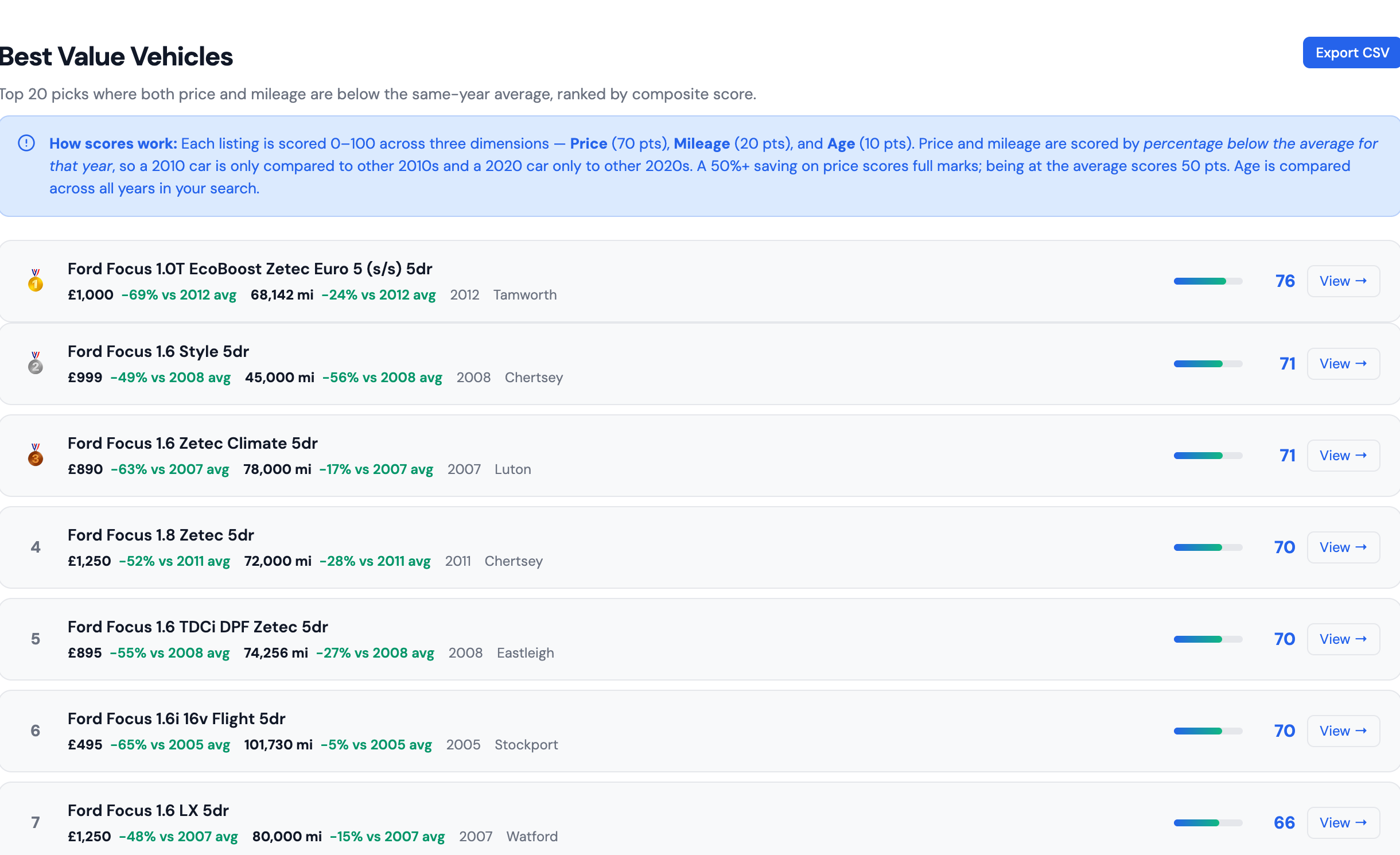
The Best Value tab: 20 listings ranked by composite score. Each is scored against other cars from the same year - not the whole market.
The Best Value tab is where AutoAlpha's scoring algorithm surfaces the best deals from across all 1,691 listings. Each listing is scored 0–100 across three dimensions:
- Price (70 points) - how far below the average for that registration year the asking price is. A car 50%+ below average scores full marks.
- Mileage (20 points) - how far below the same-year average the mileage is.
- Age (10 points) - newer cars score higher on this dimension.
Crucially, the scoring is year-relative: a 2012 Focus is only compared to other 2012 Focuses. This prevents the algorithm from simply recommending the cheapest, oldest cars - a £500 2003 Focus would score poorly despite its low price because every 2003 Focus is cheap.
The top pick from this real search:
🥇 Ford Focus 1.0T EcoBoost Zetec Euro 5 5dr - £995 · 63,123 mi · 2012 · High Wycombe · Score: 77
This car is 69% below the 2012 average price and 29% below the 2012 average mileage. A 2012 Focus typically asks around £3,200 - this one is asking £995 for fewer miles than average. That's the algorithm flagging a genuine outlier.
Scores above 70 represent genuinely significant underpricing. Scores in the 60–70 range are solid deals. Anything below 55 is roughly market-average with minor advantages on price or mileage.
Putting it all together: a 7-step analysis workflow
Here's how to use all the tabs as a complete system when buying any used car:
- Check the headline stats first. Is the median price in your budget? What's average mileage - and would that be acceptable to you? If the market doesn't fit your needs, refine your search now.
- Use the price distribution to set your expectations. Where does your budget land on the curve? Are you in the thickest part of the market (lots of choice) or the thin right tail (fewer options)?
- Use the price-by-year chart to identify your target year. Find the elbow of the depreciation curve - buy just before the price jumps steeply.
- Check the days-on-market chart before negotiating. Long average listing times mean sellers are motivated. Any car listed 60+ days is fair game for a below-asking offer.
- Check the Forecasting tab for underpriced alerts. Scan the alerts table for listings 15%+ below the same-year average. These are the algorithm's strongest signals of underpricing - investigate the top results first.
- Use the Regional tab if you're flexible on location. Find regions with high stock and low average prices - that's where sellers are keenest and negotiation is easiest.
- Start on the Best Value tab for the overall ranking. If any listing scores above 70 and is from a year you're interested in, investigate that first. Scores combine price, mileage, and age into a single signal.
Run this analysis on any car now
Every chart in this guide was built automatically from a live the UK's leading car marketplace search. Paste any the UK's leading car marketplace URL - or use the filters to pick your make, model and budget - and AutoAlpha generates all of this in under 60 seconds.
Start free search →